What attracts me to Matisse is the way he accentuates patterns by eliminating depth.
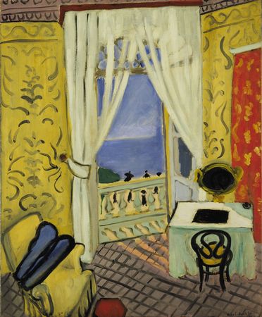
In this painting, as in so many of his works, he gives us a flat surface with a multitude of designs vying for attention: one pattern on the floor, another on the red curtain, still another on the yellow wallpaper, more yet on the crown molding.
I don't think it's going too far to say that, without the illusion of depth, the two chairs, the railing on the balcony, and the violin case become abstracted design elements rather than representations.
They're just more patterns.


